
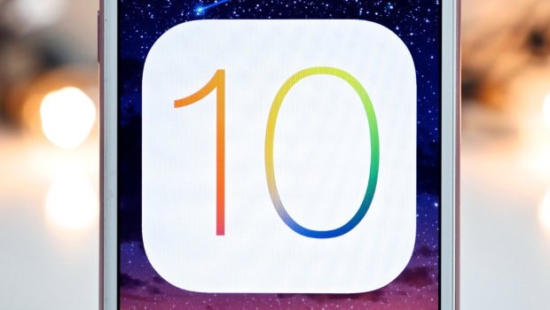
iOS 10: Update is a downgrade for Apple
I usually spend months procrastinating upgrading my iphone to the newest version of iOS. Every day, I see a pop up nagging me to install the update, and I click “remind me later.” However, when iOS10 rolled around, I decided to change my attitude and update my phone right away. This was a huge mistake.
iOS10 feels like a step back for Apple. They redesigned quite a few of the iphone features in this update, including the notification screen and control center, but that does not necessarily mean that they made them any better. A lot of the upgrades were meant to work with 3D touch; however, this feature is only available on the new iphone 7, so for those of us stuck with any earlier version, the update was pointless.
Once I figured out how to unlock my phone (you have to actually press the button now, not just scan your fingerprint), I noticed that not much had been modified. This was definitely not an iOS6 to iOS7 level change.
Overall, I would not have much of a problem with iOS10, if it were not for the changes made to the messaging app. Click on the messages app, and close your eyes. Now imagine you are traveling back in time, about 5 years. Then open your eyes and you’ll see that the time traveling worked!
The “upgraded” messaging app feels incredibly childish. With the previous versions of iOS, Apple was creating a more minimalist look, which follows the modern simplistic trend that can also be seen in updates to many social media apps. Now, suddenly, there are all sorts of colors and shapes that completely betray this stylistic pattern.
The crazy addition of text effects and animations reminds me strongly of Kidpix, the fun computer drawing program that brought me joy all throughout kindergarten. It is as if Apple suddenly found all these cool things that they can do–like make balloons appear when you say happy birthday, or let people write in glowing colors–and they got so excited that they just shoved everything into the update without considering whether or not it actually added to the quality of the phone.
These additions to the messages app seem like an attempt to revive the use of standard messaging by adding features that are available on social media apps such as Snapchat. However, these effects do not have the same draw when they are randomly thrown into the otherwise clean looking imessage.
In addition to the major change to the messaging system, there are many other minor aesthetic and functional changes in iOS10 that seem simply unnecessary. For example, the keyboard now makes a slightly different sound when you type. I might have found the sound of someone typing annoying before, but I find it even more annoying now, simply because it sounds different for no plausible reason.
On top of that, Apple decided to make all notifications now appear in bubbles, just to add to the cluttered and busy look of iOS10. They changed the clock on the lock screen appear in a slightly bolder font, just to annoy me, in particular. When you slide to open a text from the lock screen, the “view” option is now on the left instead of the right. Emojis are slightly more 3D, and somehow they look exponentially more creepy and less appealing.
You could say that I am just bitter and despise change, which is true. However, that would not change the fact that iOS10 is full of slight modifications that bring little to no improvement to the phone as a whole. Basically, my advice to Apple is: if it ain’t broke, don’t fix it

